
Looking for the Microsoft 365 version? Try Accessible Excel workbooks in Microsoft 365
Accessibility Checker
Microsoft Office (Word, Excel, Power Point) provides a built-in accessibility validator. The checker does not identify all issues, but looks for things such as: missing alternative text, duplicate slide titles, and potential reading order issues.
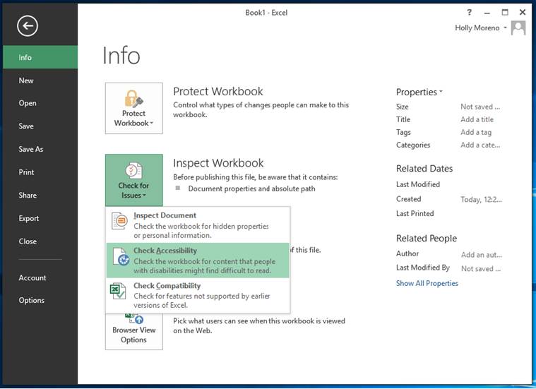
How to use the Accessibility Checker:
- Activate the File Tab > Info > Check for Issues > Check Accessibility
- Review the results in the Accessibility Checker pane
- Address the listed issues. Helpful information to understand and fix the different issues is provided at the bottom of the pane
Tables
Avoid using complex table structures in all documents. If tables include nested tables, merged cells, split cells and/or blank rows/ columns, they become difficult for screen readers to navigate . When using a table, design it to be as simple as possible. Assign meaningful names to the headers and rows to facilitate user navigation.
Sheet tabs
Give all sheet tabs in your document unique and meaningful names. Ensure that the name given to each tab accurately describes the contents found on the worksheet. This will make it easier to navigate through the workbook. It is best to remove all blank sheets from your document.
Fonts
Choose fonts and styles that are easy to read.
- Use sans-serif fonts with sufficient spacing between letters (Ex. Arial, Verdana, Century Gothic)
- Use fonts 11-14 points in size
Use of colour
Use a contrast checking tool to check the contrast of the text (foreground) relative to the background. For most text, the contrast ratio must be 4.5:1. For large, bold text (14 point bold, or 18 point regular), this requirement is relaxed to 3:1. Since it is extremely likely that the sheet will be viewed at low zoom (so as to see more of it), all text should meet 4.5:1 minimum. The WCAG AAA requirement is 7:1 – aim for this.
Do not use colour alone to convey meaning or emphasis in a word, cell or block of text. Patterns may be added to colour for those who are colour blind. Mandatory fields should be identified with an asterisk * and the word “required” rather than being labelled in red.
Non-text elements
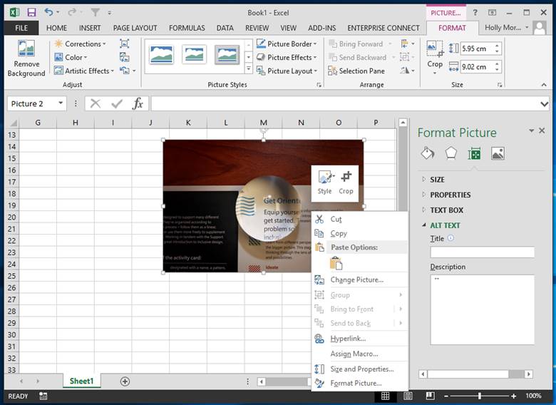
Alternative text
Visual elements such as photos, screenshots, icons, videos and 3D models should all include alternative text. Alt text allows people who cannot see the image understand the message and what is important. A good alt text should be concise and to the point. It should not be more than a sentence or two and should include the important information the image conveys. When creating an alt text, do not begin with “this is an image of”. Do begin with “Screenshot of” for screenshots.
To assign alternative text to images:
- Open the context menu for the image by right-clicking or pressing the applications key
- Activate Format Picture
- Activate the Size and Property tool
- Enter a title in the Title field. Note: This field should only be filled in if you are entering a detailed or long explanation in the Description field
- Enter an appropriate alternative text in the Description field
- If the image is meaningful, convey in words the meaning, function, or purpose communicated by the image
- If an image conveys no information (i.e., it is decorative or redundant), enter the word “decorative” (no quotes) in the Description field
- Activate the Close button
Charts and diagrams
Ensure complex images and charts provide long descriptions. Complex images include: schematics, plans, diagrams, or any other image that conveys a large amount of information. This is necessary as users who cannot see the complex image will not be able to sufficiently determine its value/purpose.
To add a long description to diagrams and chart:
- Open the context menu for the chart/diagram and activate Format Chart Area
- The Format Chart Area menu will open
- Activate Size and Properties
- Provide a meaningful long description
- Describe the title of the chart
- The role it plays in the document
- The relationship of elements in the correct order
- Activate the Close button
See Complex Images for more recommendations.
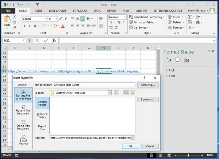
Links
People who use screen readers sometimes scan a list of links; therefore, ensure link text is meaningful within the context of the document. Link text should accurately reflect the target and purpose of the link. If link text is not provided, users will need to follow the link to determine its purpose, which can present difficulties for users of adaptive technology. An example of appropriate link text would be including the full title of the destination rather than linking to the text “Click Here”.
To add hyperlinks with meaningful text:
- Type or paste a web address in your document
- Select the link and open the context menu
- Activate Hyperlink
- Edit the Text to Display field with meaningful text.
Additional resources
- Microsoft: Make your Excel documents accessible to people with disabilities
- Microsoft: Accessibility support for people who use a screen reader program
Looking for the Microsoft 365 version? Try Accessible Excel workbooks in Microsoft 365
Page details
- Date modified: