
Looking for the Microsoft 365 version? Try Accessible Visio drawings in Microsoft 365
Introduction
Microsoft Visio is used to create diagrams such as flow charts. The accessibility issues for such a diagram fall into two categories: those affecting sighted users with disabilities (who will be using the diagram visually), and those affecting blind users (who rely on the text alternatives). Following accessibility recommendations in each of these areas will also be of benefit to all users.
Visual and general accessibility
Many of the general document and infographic accessibility guidelines also apply to Visio documents. Please review the General and Infographic guides for more information.
Text contrast
Text contrast must be at least 4.5:1 against the background. Because diagrams are often viewed at very low zoom, we recommend that you maintain at least this level of contrast for all text, regardless of size.
- To verify colour contrast, use a tool such as Colour Contrast Analyser or WebAIM Contrast Checker
- Do not place complex background images behind text
- When complex background images or low-contrast backgrounds must be used, provide an outline around the text that provides sufficient contrast against the text foreground colour
Using colour alone to convey information
Ensure that colour is not the sole means of communicating information. As colour coding is a common strategy in infographics, this is a common accessibility failure. All information communicated via colour should also be available through other methods of identification (visually and textually), such as text labels, symbols, or adding a unique pattern to the colour coded area.
Non-text contrast
In WCAG 2.1, all meaningful graphical elements must have a 3:1 contrast ratio against the background. Where colour or shading is used to identify areas of the chart, such as to delineate an inner box from an outer box, the two colours must have a 3:1 contrast ratio (as one of them is now the “background”).
See Understanding non-text contrast for examples of graphical objects (icons), charts, and infographics and how they pass, fail, or can be made to pass this criterion.
Abbreviations
As diagrams are often dense with abbreviations, defining these abbreviations will aid in understanding for all users. See WCAG’s guidelines for Abbreviations
If possible within the layout, you can define abbreviations inline at their first occurrence. ex. Accessibility, Accommodations, and Adaptive Computer Technology (AAACT)
Due to diagrams often being viewed in a non-linear order, it is usually preferable to provide a glossary. The glossary should be in text within the document, under a heading such as “Glossary of abbreviations” so that it can be easily found.
Text in images
Unless it is essential to do so, do not embed text inside images.
Text alternatives
Visio diagrams, by their nature, communicate information visually. Although Visio has some capability for blind users to navigate documents (see “Visio accessibility features” below), a text alternative that doesn’t depend on the visual organization is essential when you are distributing the Visio document as a PDF or image, or embedding the diagram in another document / web page.
Short (alt) text summary
A short text (65 characters or less) should answer the question “What information is the diagram conveying?” The short text can act as a meaningful title for the diagram.
Long text description
Depending on the diagram, it may be difficult to provide a complete linear description in text. Imagine that you are describing the diagram to a person over the phone.
The long text summary is useful for all users. Make it visible in the web page or PDF so that everyone can read it. See Complex Images for recommendations.
Examples
For a road map with directions, the long description should describe each step to follow the directions.
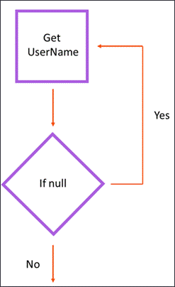
In order to best convey the message of the above flow chart to all users, the long description should use numbered components:
Flowchart illustrating the login process:
- 1.0 Get Username
- 1.1 Go to Step 2.0
- 2.0 Is Username blank?
- 2.1 If Yes, go back to step 1.0
- 2.2 If No, continue to step 3.0
- 3.0 Complete login
For a component diagram, the long description should begin with a summary of the major components of the diagram (between 3 and 10) and how they are related. Following that, details such as the complete text within the components can be placed under headings for each component. Make use of the various levels of headings to organize the sub-components. Users can search for components of interest to them as long as the text is included in the page.
Hypertext representation
Using HTML, a complete textual description including all relationships with hyperlinks may be possible. Extending the long description format (described above for flowchart and component diagram) with in-page links to related components could improve usability, as screen reader users could more quickly “follow the arrows”.
Example for complex data flow diagram:
Component D (Header)
Data Sources:
- Component A (links to #id of Component A header)
- Component B (links to #id of Component B header)
Data Flows to:
- Component C (links to #id of Component C header) through Connector 1 (links to #id of Connector 1 header)
Follow with other relevant information about component D.
Visio accessibility features
Microsoft has recently published a guide on making Visio diagrams accessible.
It is important to understand how a screen reader user would read a Visio diagram:
- They will use the Tab key to move through the shapes in a pre-specified order
- Shapes will be described according to their alt text, position, and formatting
- The starting and ending points for connectors are announced
This brings up the two main accessibility features for Visio documents: reading order and alt text.
Reading order
Generally, objects will be read in the order in which they were added to the document. Create the objects in the order in which you want them to be read.
You can also review and edit the reading order. Select View > Task Panes > Navigation, and then drag and drop the shapes to reflect a logical reading order.
Create connectors (arrows, etc.) in the order you want them to be read. Begin drawing from the starting point (i.e. the parent in a unidirectional flowchart) – do not draw any arrows “backwards” and then style them to face the opposite way.
Alternative text (“alt text”)
Visio has the ability to add alt text to images, shapes, and entire pages. Generally, no more than short alt text would be required for an image or shape. A longer description would be suitable for a page. Refer to the general accessibility guidelines and making Visio diagrams accessible.
To add alt text to an image or shape:
- Open the context menu for the image or shape by right-clicking or pressing the application key
- Select Format Shape.
- Select
 Size & Properties and enter the alternate text under Description.
To add alt text to entire page, press Shift+F5. Select the Alt Text tab and enter the Description.
Accessibility checker
Like most Office products, Visio now has a built-in accessibility checker.
In the ribbon toolbar, go to Review > Check Accessibility. Select each item to view details and fix the issues one by one.
Additional resources
- NVDA: Free screen reader (useful for testing)
- Web Content Accessibility Guidelines 2.1
Looking for the Microsoft 365 version? Try Accessible Visio drawings in Microsoft 365
Page details
- Date modified: